Dynamic Transmission Risk
Structure
In SIR: Factors Influencing Spread, we assumed a constant daily rate of transmission risk during the infectious period. This is in keeping with the SIR model, however, in reality we know that transmission risk is influenced by an infected person’s viral load, which is a dynamic property.
Here we will demonstrate how to incorporate dynamic transmission risk and compare its impact to the outcomes of the SIR simulations.
The model and parameters used in this scenario are derived from a paper from the Fred Hutchinson Cancer Research Center, henceforth known as the Hutch model.
In particular, the Hutch model requires the following parameters in a Gamma-distributed contact regime:
- average of 4 contacts per day per subject, \(\overline{k}\)
- dispersion of 40, \(\omega\)
- These parameters should result in \(R_0\) 1.8.
This is achieved using Events. See Sizing for a detailed demonstration.
The group structure continues to be informed by CDC Best Planning Scenario guidelines for IFR.
Other assumptions:
- Population of 10,000
- proportionately split among the 4 age groups to match US Census data.
- Initial Infected of 2
- Duration of Immunity 365 days
- Density of 1 dot / location (excluding the vbox)
- a collection of 9,142 separate events, each recurring every 30 days.
The transmission risk curve used in these simulations is visualized below. See Hutch Model for the derivation.

Events
Here we show the basic outcome of dynamic viral load in a gamma-distributed contacts environment.
The transmission curve has bee calculated separately and is available as tmr from the rknot.dots.fhutch module.
All of the 9,000+ events occur in the “Events” vbox. All events have capacities of 3 subjects or more.
Again, details on the event structure are found here.
from rknot import Sim, Chart

from rknot.dots.fhutch import tmr
from rknot.sims.us_w_load_18 import events

group1 = dict(name='0-19', n=2700, n_inf=0, ifr=0.00003, mover=.98)
group2 = dict(name='20-49', n=4100, n_inf=1, ifr=0.0002, mover=.98)
group3 = dict(name='50-69', n=2300, n_inf=1, ifr=0.005, mover=.98)
group4 = dict(name='70+', n=900, n_inf=0, ifr=0.054, mover=.98)

vbox = {'label': 344, 'box': 344}
params = {'groups': groups, 'density': 1, 'days': 365, 'tmr_curve': tmr, 'vboxes': vbox, 'events': events}

sim = Sim(**params)
sim.run()

chart = Chart(sim).to_html5_video()
The results are:
| Hutch | SIR | |
|---|---|---|
| Peak | 35.6% | 29.0% |
| HIT | 42.4% | 56.0% |
| Total | 50.2% | 82.0% |
| Fatalities | 0.30% | 0.50% |
| %>70 | 80.0% | 39.0% |
| IFR | 0.60% | 0.61% |
| Days to Peak | 63 | 77 |
The results relative to the SIR Events simulation are lower across the board, which is mainly attributable to the lower \(R_0\) utilized. With \(R_0\) of 1.8, we would expect HIT of ~44%, which is close to the result here.
There are two other important differences:
- the peak occurs earlier
- there is a narrower range between peak/hit/total infections
These differences result for a couple reasons:
- in the Hutch model used here, the infection duration is 30 days, double that used in SIR. Thus, as new infections occur, there are fewer recoveries.
- while the infection duration is longer, the likelihood of infection is highly concentrated in the 3 to 5 day period of peak viral load. Thus, to achieve the same \(R_0\), there must be more infections sooner. By the same token, as herd immunity is reached and more infections reach later life cycle, there are fewer infections to extend the tail.
Fatality measures are inline with expectations from SIR model.
Using the looper function demonstrated in Sizing, we can quickly generate a sample of simulations to determine patterns.
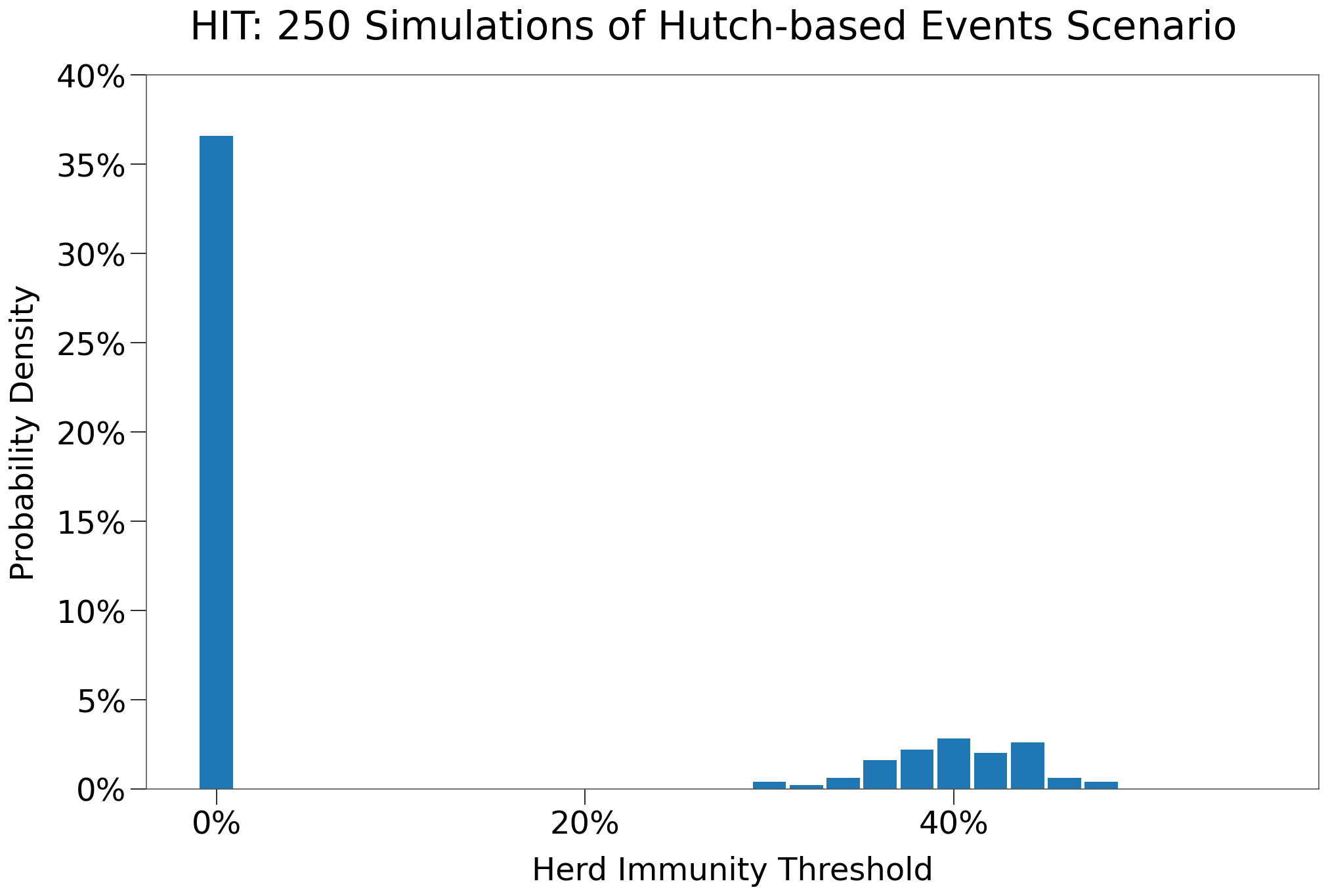
The table below shows the results of 250 iterations of this scenario:
| Events | Events $R_0$ > 0 | |
|---|---|---|
| n | 250 | 68 |
| Peak | 8.9% | 32.7% |
| HIT | 11.1% | 40.6% |
| Total | 14.0% | 51.5% |
| Fatalities | 0.08% | 0.30% |
| %>70 | 6.5% | 6.5% |
| IFR | 0.55% | 0.60% |
| Days to Peak | 24 | 74 |
| $R_0$ = 0 | 51.6% | 0.0% |
The chart below shows the distribution of HIT for each of the 250 simulations. The vast majority of simulations resulted in no secondary infections (i.e. an outbreak never occured). Where an outbreak did take hold, outcomes centered around ~40% HIT.
Care Homes
We replicate the SIR Gates scenario by creating a separate group of elderly isolated within a gate, intended to simulate care homes or assisted living centers.
One augmentation is made: a small group of care home workers are added that will reqularly enter the gate to service residents. The care home workers will be drawn from the 20-49 age group.
The new groups are:
group2b- population of 66
- Assuming 2.2MM care home workers in the United States out of a population of 330MM.
- remaining attributes similar to
20-49 - events individual travel events for half the group, recurring every day
group4a- population of 600 (2/3s of
group4) - IFR of 4.2%
- remaining attributes mathcing prior
70+group
- population of 600 (2/3s of
group4b- population of 300 (1/3rd of
group4) - 25 locations
- IFR of 7.8%
- ‘local’ mover function
- not eligible for any events
- population of 300 (1/3rd of
group4b used the local mover and its gated area has increased density. This is perhaps counter-intuitive. Care home residents are likely more well-mixed than the broader population and more closely follow normally-distributed contacts. So we approximate increased mixing with a higher p-value. Ideally, contact distribution in such environments would be researched for guidance.
The event vbox has been adjusted to include the 5 groups that are not gated.
from rknot import Sim, Chart
from rknot.events import Travel
from rknot.dots.fhutch import tmr

from rknot.sims import us_w_load_18

group1 = dict(name='0-19', n=2700, n_inf=0, ifr=0.00003, mover=.98)
group2a = dict(name='20-49', n=4034, n_inf=1, ifr=0.0002, mover=.98)
group2b = dict(name='HCW', n=66, n_inf=0, ifr=0.0002, mover=.98)
group3 = dict(name='50-69', n=2300, n_inf=1, ifr=0.005, mover=.98)
group4a = dict(name='70+', n=600, n_inf=0, ifr=0.042, mover=.98)
group4b = dict(name='70+G', n=300, n_inf=0, ifr=0.0683, mover='local', box=[1,5,1,5], box_is_gated=True)

groups = [group1, group2a, group2b, group3, group4a, group4b]

for e in us_w_load_18.events:
    e.groups = [0,1,2,3,4]

visit = Travel(name='visit', xy=[1,1], start_tick=3, groups=[1,3,4], capacity=1, duration=1, recurring=1)

works = []
for i in range(group2b['n'] // 2):
    loc  = np.random.randint(1, 11, size=(2,))
    work = Travel(name=f'hcw-work-{i}', xy=loc, start_tick=1, groups=[2], capacity=1, duration=1, recurring=1)
    works.append(work)

for e in events_gated:
    e.groups = [0,1,2,3,4]
events_gated = events_gated + [visit] + works

vbox = {'label': 'Events', 'box': 344}
params = {'groups': groups, 'density': 1, 'days': 365, 'tmr_curve': tmr, 'vboxes': vbox, 'events': us_w_load_18.events}

sim = Sim(**params)
sim.run(dotlog=True)

chart = Chart(sim).to_html5_video()
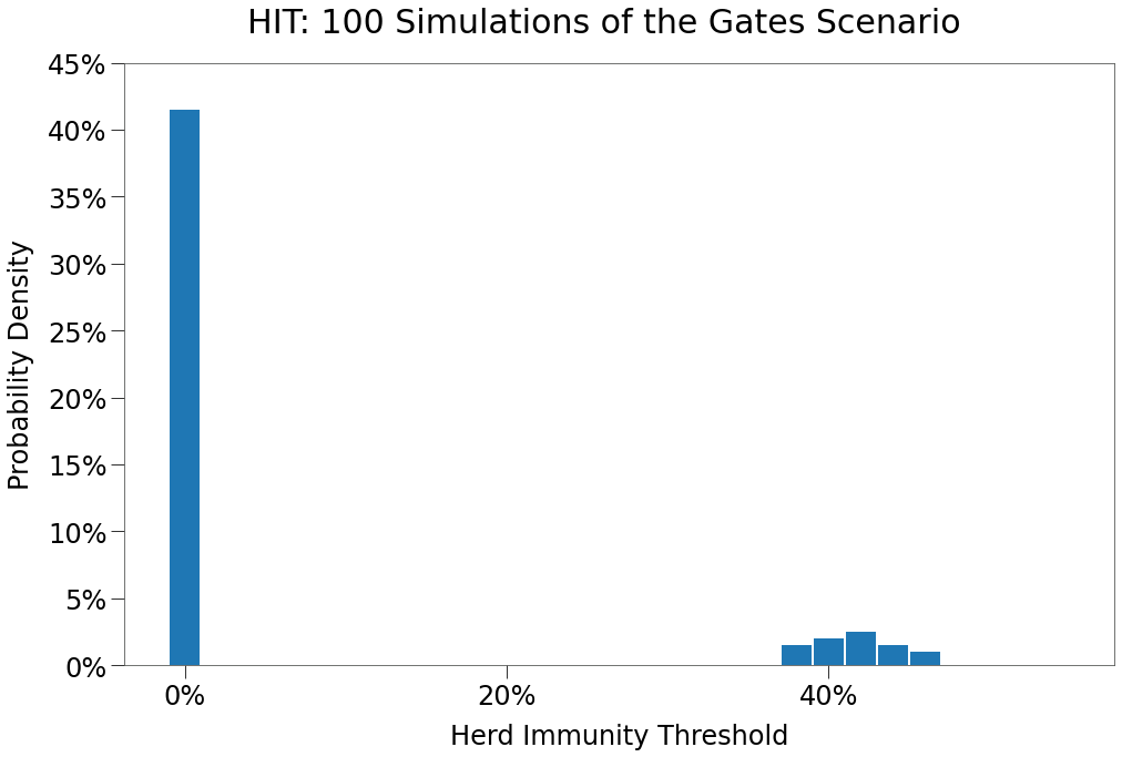
This time, we will first run 100 simulations of the scenario to find the average outcomes. The average results are shown in the table below:
| Gates | Gates $R_0$>0 | |
|---|---|---|
| n | 100 | 19 |
| Peak | 5.8% | 30.2% |
| HIT | 7.3% | 38.2% |
| Total | 9.2% | 47.9% |
| Fatalities | 0.07% | 0.37% |
| %>70 | 85.2% | 85.2% |
| IFR | 0.14% | 0.73% |
| Days to Peak | 19 | 70 |
| $R_0$ = 0 | 51.0% | 0.0% |
Below we can see the distribution of HIT, which is very similar to the Events.
And now we generate a representative simulation:
The results are shown below compared to SIR scenario:
| Hutch | SIR | |
|---|---|---|
| Peak | 33.1% | 30.0% |
| HIT | 44.1% | 62.0% |
| Total | 55.1% | 83.0% |
| Fatalities | 0.38% | 0.52% |
| %>70 | 92.1% | 40.0% |
| IFR | 0.69% | 0.62% |
| Days to Peak | 83 | 66 |
Again, relative to SIR, the simulation has a lower peak. In this instance the peak is also significantly later as well. Consistent with the Events scenario, a larger proportion of the fatalities are experienced among the elderly.
Capacity Restriction
As with the SIR Model simulations, we can explore the impact of policy restrictions on spread in our more sophisticated environment. First, we will restrict large gatherings.
We’ll again restrict gatherings with 10+ capacity. We assume this policy is implemented on day 30. The restriction will last for 120 days.
With a gamma distributed contact distribution, a very large number of contacts can be eliminated by eliminating just a small fraction of events.
import numpy as np

caps = np.array([e.capacity for e in us_w_load_18.events_gated])
n_events = caps.shape[0]
n_events_gt10 = np.bincount(caps)[10:].sum()
per = n_events_gt10 / n_events
| # of Events | Events Cap > 10 |
% |
|---|---|---|
| 8,866 | 1,503 | 17.0% |
counts, bins = np.histogram(caps-1, bins=np.arange(max(caps) + 1))
contacts = counts*(np.arange(counts.shape[0])+1)
c_gt10 = np.sum(contacts[10:]*np.arange(10, contacts[10:].shape[0] + 10))
c = np.sum(contacts*np.arange(contacts.shape[0]))
c_per = c_gt10 / c
| # of Events | Events Cap > 10 |
% |
|---|---|---|
| 964,452 | 814,230 | 84.4% |
The updated structure is as follows:
from rknot.events import Restriction

lg = Restriction(name='large', start_tick=30, duration=120, criteria={'capacity': 10})

events_w_res = events_gated + [lg]

params = {'groups': groups, 'density': 1, 'days': 365, 'tmr_curve': tmr, 'vboxes': vbox, 'events': events_w_res}

sim = Sim(**params)
sim.run(dotlog=True)

chart = Chart(sim).to_html5_video()
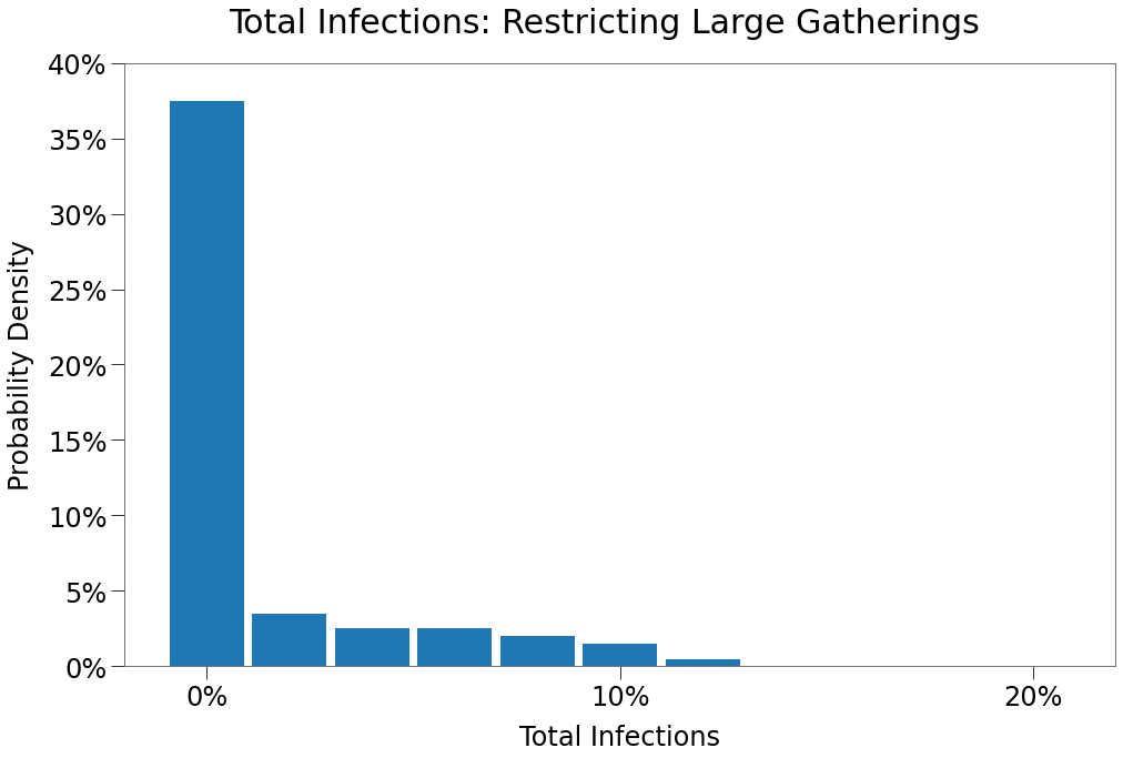
We again show the average results of 250 simulations in the table below:
| 10Max | 10Max $R_0$ > 0 | |
|---|---|---|
| n | 100 | 31 |
| Peak | 1.6% | 5.0% |
| HIT | 1.7% | 5.3% |
| Total | 1.8% | 5.5% |
| Fatalities | 0.03% | 0.11% |
| %>70 | 77.5% | 77.5% |
| IFR | 0.52% | 1.55% |
| Days to Peak | 18 | 41 |
| $R_0$ = 0 | 51.0% | 0.0% |
We can see that restricting contacts to a maximum of 10 per day has a dramatic impact on spread, reducing the total amount of infections and significantly shortening the duration.
We can see below that the vast majority (almost 80%) of simulations resulted in no outbreak at all. Note, however, that some simulations resulted in moderate outbreaks of 10% total infections or more. So given enough iterations (say among different municipalities, provinces, states or countries), a significant outbreak is sure to occur despite the best efforts of policy.
The results of the simulation are shown in the table below, compared with the same scenario from the SIR model simulations:
| Hutch | SIR | |
|---|---|---|
| Peak | 7.4% | 15.0% |
| HIT | 7.8% | 28.0% |
| Total | 8.1% | 73.0% |
| Fatalities | 0.18% | 0.45% |
| %>70 | 100.0% | 38.0% |
| IFR | 2.21% | 0.62% |
| Days to Peak | 40 | 69 |
The Hutch model results in a far more muted curve. This aligns with research that indicates super-spreader events (where a single individual is responsible for a large number of secondary infections) are responsible for the vast majority of secondary infections.
When those superspreader events are eliminated, spread is curtailed.
This result is somewhat confounding, however, given that many jurisidictions across the global have implemented a similar policy without such a dramatic impact.
Some reasons for this deviation may include:
- few policies have truly limited all people to less than 10 contacts per day for 120 days. Often there have been exemptions for essential services. For example, during the second wave in North America, many children continued to go to school.
- adherence to such policies is likely not 100%.
- mixing amongst jurisdictions with different policies
Capacity Restrictions with Adherence
To investigate the impact of adherence (or lack thereof), simulations were ran for a dozen scenarios of different maximum event capacities and adherence factors (and some combinations). The results are shown in the tables below:
| 10Max | 25Max | 50Max | 75Max | 10Max $R_0$ > 0 | 25Max $R_0$ > 0 | 50Max $R_0$ > 0 | 75Max $R_0$ > 0 | |
|---|---|---|---|---|---|---|---|---|
| n | 100 | 100 | 100 | 100 | 31 | 17 | 24 | 26 |
| Peak | 1.6% | 1.1% | 3.9% | 6.4% | 5.0% | 6.2% | 15.8% | 24.5% |
| HIT | 1.7% | 1.2% | 5.4% | 8.2% | 5.3% | 6.7% | 22.3% | 31.5% |
| Total | 1.8% | 1.2% | 7.6% | 11.4% | 5.5% | 7.0% | 31.3% | 43.7% |
| Fatalities | 0.03% | 0.01% | 0.07% | 0.09% | 0.11% | 0.08% | 0.30% | 0.34% |
| %>70 | 77.5% | 65.5% | 77.0% | 80.7% | 77.5% | 65.5% | 77.0% | 80.7% |
| IFR | 0.52% | 0.80% | 0.79% | 0.50% | 1.55% | 0.97% | 0.95% | 0.72% |
| Days to Peak | 18 | 14 | 27 | 24 | 41 | 44 | 86 | 74 |
| $R_0$ = 0 | 51.0% | 53.0% | 50.0% | 56.0% | 0.0% | 0.0% | 0.0% | 0.0% |
And below the results of different adherence factors for a policy of maximum capacity 10. Adherence of 100 means full compliance and matches the first scenario above. Aherence of 0 means no compliance and outcomes match that of the Gates scenario above.
We have split the table in two sections, one with all simulations and the second showing only those with secondary infections.
| 0ADH | 10ADH | 25ADH | 50ADH | 75ADH | 90ADH | 100ADH | |
|---|---|---|---|---|---|---|---|
| n | 100 | 100 | 100 | 100 | 100 | 100 | 100 |
| Peak | 6.8% | 8.7% | 4.6% | 1.2% | 1.2% | 0.9% | 1.6% |
| HIT | 8.7% | 11.6% | 5.7% | 1.4% | 1.3% | 1.0% | 1.7% |
| Total | 10.8% | 15.7% | 7.6% | 1.6% | 1.5% | 1.0% | 1.8% |
| Fatalities | 0.08% | 0.12% | 0.07% | 0.03% | 0.02% | 0.01% | 0.03% |
| %>70 | 72.3% | 83.2% | 90.0% | 86.4% | 76.5% | 70.7% | 77.5% |
| IFR | 0.27% | 0.62% | 0.29% | 0.64% | 0.33% | 0.27% | 0.52% |
| Days to Peak | 22 | 33 | 24 | 15 | 16 | 16 | 18 |
| $R_0$ = 0 | 61.0% | 44.0% | 50.0% | 56.0% | 52.0% | 51.0% | 51.0% |
| 0ADH $R_0$ > 0 | 10ADH $R_0$ > 0 | 25ADH $R_0$ > 0 | 50ADH $R_0$ > 0 | 75ADH $R_0$ > 0 | 90ADH $R_0$ > 0 | 100ADH $R_0$ > 0 | |
|---|---|---|---|---|---|---|---|
| n | 20 | 36 | 29 | 20 | 26 | 20 | 31 |
| Peak | 33.8% | 24.0% | 15.7% | 5.8% | 4.5% | 4.0% | 5.0% |
| HIT | 43.3% | 32.2% | 19.6% | 6.6% | 4.9% | 4.2% | 5.3% |
| Total | 53.5% | 43.5% | 25.9% | 7.8% | 5.5% | 4.5% | 5.5% |
| Fatalities | 0.38% | 0.34% | 0.25% | 0.14% | 0.09% | 0.08% | 0.11% |
| %>70 | 72.3% | 83.2% | 90.0% | 86.4% | 76.5% | 70.7% | 77.5% |
| IFR | 0.71% | 0.80% | 1.01% | 1.64% | 1.08% | 1.17% | 1.55% |
| Days to Peak | 83 | 78 | 67 | 52 | 42 | 39 | 41 |
| $R_0$ = 0 | 0.0% | 0.0% | 0.0% | 0.0% | 0.0% | 0.0% | 0.0% |
Finally, we combined limited adherence with the other maximum capacity policies, as per the table below:
| 10Max 0ADH | 25Max 0ADH | 50Max 0ADH | 75Max 0ADH | 10Max 10ADH | 25Max 10ADH | 50Max 10ADH | 75Max 10ADH | 10Max 25ADH | 25Max 25ADH | 50Max 25ADH | 75Max 25ADH | |
|---|---|---|---|---|---|---|---|---|---|---|---|---|
| n | 20 | 20 | 27 | 22 | 36 | 23 | 31 | 17 | 29 | 28 | 18 | 23 |
| Peak | 33.8% | 33.6% | 33.0% | 33.1% | 24.0% | 29.2% | 32.9% | 30.8% | 15.7% | 19.6% | 28.2% | 32.2% |
| HIT | 43.3% | 42.7% | 42.0% | 43.5% | 32.2% | 39.2% | 41.5% | 41.5% | 19.6% | 28.5% | 36.3% | 40.4% |
| Total | 53.5% | 54.4% | 52.1% | 54.0% | 43.5% | 49.8% | 52.9% | 52.9% | 25.9% | 38.9% | 49.0% | 49.9% |
| Fatalities | 0.38% | 0.39% | 0.38% | 0.40% | 0.34% | 0.39% | 0.38% | 0.38% | 0.25% | 0.31% | 0.38% | 0.37% |
| %>70 | 72.3% | 80.4% | 82.5% | 77.3% | 83.2% | 85.2% | 81.8% | 84.6% | 90.0% | 86.8% | 83.3% | 84.5% |
| IFR | 0.71% | 0.72% | 0.70% | 0.75% | 0.80% | 0.78% | 0.72% | 0.73% | 1.01% | 0.77% | 0.78% | 0.71% |
| Days to Peak | 83 | 76 | 79 | 80 | 78 | 81 | 77 | 84 | 67 | 81 | 84 | 72 |
| $R_0$ = 0 | 0.0% | 0.0% | 0.0% | 0.0% | 0.0% | 0.0% | 0.0% | 0.0% | 0.0% | 0.0% | 0.0% | 0.0% |
| 10Max 50ADH | 25Max 50ADH | 50Max 50ADH | 75Max 50ADH | 10Max 75ADH | 25Max 75ADH | 50Max 75ADH | 75Max 75ADH | 10Max 90ADH | 25Max 90ADH | 50Max 90ADH | 75Max 90ADH | 10Max 100ADH | 25Max 100ADH | 50Max 100ADH | 75Max 100ADH | |
|---|---|---|---|---|---|---|---|---|---|---|---|---|---|---|---|---|
| n | 20 | 17 | 19 | 26 | 26 | 29 | 17 | 20 | 20 | 23 | 26 | 21 | 31 | 17 | 24 | 26 |
| Peak | 5.8% | 11.2% | 19.4% | 26.9% | 4.5% | 7.6% | 17.9% | 25.5% | 4.0% | 6.4% | 13.1% | 26.6% | 5.0% | 6.2% | 15.8% | 24.5% |
| HIT | 6.6% | 17.1% | 27.9% | 35.9% | 4.9% | 8.6% | 26.0% | 36.5% | 4.2% | 7.1% | 19.4% | 36.6% | 5.3% | 6.7% | 22.3% | 31.5% |
| Total | 7.8% | 23.6% | 39.3% | 47.4% | 5.5% | 10.3% | 33.6% | 47.2% | 4.5% | 7.7% | 26.4% | 47.3% | 5.5% | 7.0% | 31.3% | 43.7% |
| Fatalities | 0.14% | 0.23% | 0.32% | 0.38% | 0.09% | 0.13% | 0.31% | 0.36% | 0.08% | 0.12% | 0.27% | 0.36% | 0.11% | 0.08% | 0.30% | 0.34% |
| %>70 | 86.4% | 79.0% | 82.7% | 75.8% | 76.5% | 82.1% | 82.9% | 73.0% | 70.7% | 73.7% | 74.9% | 74.9% | 77.5% | 65.5% | 77.0% | 80.7% |
| IFR | 1.64% | 0.84% | 0.76% | 0.79% | 1.08% | 1.14% | 0.99% | 0.77% | 1.17% | 1.31% | 1.05% | 0.77% | 1.55% | 0.97% | 0.95% | 0.72% |
| Days to Peak | 52 | 78 | 84 | 79 | 42 | 51 | 85 | 81 | 39 | 48 | 80 | 88 | 41 | 44 | 86 | 74 |
| $R_0$ = 0 | 0.0% | 0.0% | 0.0% | 0.0% | 0.0% | 0.0% | 0.0% | 0.0% | 0.0% | 0.0% | 0.0% | 0.0% | 0.0% | 0.0% | 0.0% | 0.0% |
The above tables are a bit busy, so we prepared a heat map across the two dimensions of capacity and adherence with color corresponding to total infections.
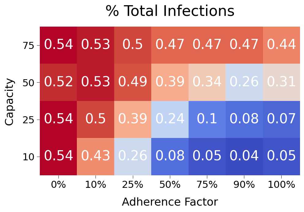
Some findings from the data above:
- restricting capacity is very impactful right up to 75 max capacity. So restricting only just the largest events should still have a moderating effect on spread.
- adherence factor has only a very modest impact on spread at the higher factors. If fully 20% of subjects are not observing the prescribed policies, this shouldn’t lead to dramatic increase in spread. Even at 50% adherence, spread is significantly muted relative to no policy at all.
- A 25 capacity restriction at ~75% adherence would result in just 10% total infections across the population. This appears to be a good target that allows for some flexibility.
For comparison purposes, we will show a sample simulation of the 25 Max, 50% adherence scenario.
from rknot.events import Restriction

lg = Restriction(name='large', start_tick=30, duration=120, criteria={'capacity': 25}, adherence=.75)

events_w_res = events_gated + [lg]

params = {'groups': groups, 'density': 1, 'days': 365, 'tmr_curve': tmr, 'vboxes': vbox, 'events': events_w_res}

sim = Sim(**params)
sim.run(dotlog=True)

chart = Chart(sim).to_html5_video()
The results of th sim are shown below in comparison to our base 10 max capacity scenario:
| 25Max 75Adh | 10Max 100Adh | |
|---|---|---|
| Peak | 7.7% | 7.4% |
| HIT | 8.7% | 7.8% |
| Total | 13.3% | 8.1% |
| Fatalities | 0.19% | 0.18% |
| %>70 | 89.5% | 100.0% |
| IFR | 1.43% | 2.21% |
| Days to Peak | 50 | 40 |
So restricting contacts to maximum 25 per day has a similar impact on spread even with only 75% adherence to the policy.
Social Distancing
We will now investigate the impact of social distancing measures as outlined here.
We provice tmfs to each age group, representing the adherence to and impact of various tactics including 6-feet of distance, masks, hand sanitizer, etc.
The policy measure is implemented on day 30 and maintained for 120 days.
Note we set group2b to tmf=.5, indicating much striter adherence to social distancing practices than its age cohort (which is likely consistent with care home workers in the real world).
from rknot.events import SocialDistancing as SD

sd = SD(name='all', tmfs=[.8, .8, .5, .7,.65,.5], groups=[0,1,2,3,4,5], start_tick=30, duration=120)

events_w_res = events_gated + [sd]

params = {
    'groups': groups, 'density': 1, 'days': 365, 'tmr_curve': tmr,
    'vboxes': {'label': 'Events', 'box': 344}, 'events': us_w_load_18.events
}

sim = Sim(**params)
sim.run()

chart = Chart(sim, use_init_func=True)
chart.animate.to_html5_video()
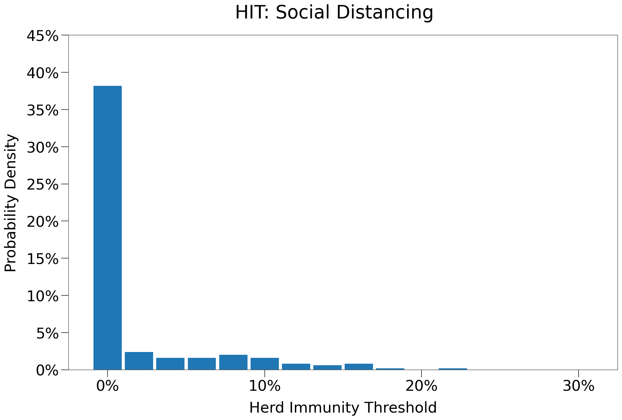
The average results of 250 iterations of the scenario are shown in the table below:
| SD | SD $R_0$ > 0 | |
|---|---|---|
| n | 250 | 64 |
| Peak | 1.9% | 7.2% |
| HIT | 2.1% | 8.1% |
| Total | 2.8% | 10.6% |
| Fatalities | 0.01% | 0.06% |
| %>70 | 67.3% | 67.3% |
| IFR | 0.54% | 0.51% |
| Days to Peak | 16 | 48 |
| $R_0$ = 0 | 54.0% | 0.0% |
The distribution of infections is heavily skewed towards zero with fairly volatile deviations at the margin.
The results of the simulation are compared to the SIR model below:
| Hutch | SIR | |
|---|---|---|
| Peak | 7.1% | 8.0% |
| HIT | 7.7% | 24.0% |
| Total | 14.0% | 68.0% |
| Fatalities | 0.03% | 0.39% |
| %>70 | 0.0% | 33.0% |
| IFR | 0.21% | 0.57% |
| Days to Peak | 49 | 96 |
Here we see that social distancing has an even more pronounced impact on spread. The peak and hit are flattened significantly, but the tail is also much shorter.
A lower \(R_0\) is in part responsible, but so too is the viral load curve in Hutch, which has a longer infection duration but a much shorter truly infectious period.
Additionally, fatalities are MUCH lower by a factor of 10. This is due to the lower overall infection level, but note that an outbreak was prevented in the care home (70+G area). With the shorter infectious period, the virus has fewer opportunities to enter the gate.
Social Distancing with Adherence
As with Capacity Restrictions above, we can investigate the impact that sub-100% adherence might have on spread.
Adherence with respect to SocialDistancing requires one additional consideration. A single event is used to cover all the groups in the sim, however, each group is likely to have a different adherence factor given their differing perceived risk factors and motivations.
For instance, 70+G subjects are likely to have very high adherence given the known risks invovled and the supervision provide by home care professionals. 20-49 subjects (particularly the youngest in the group) exhibit greater risk-taking behavior in general and covid-19 has provded no different; their adherence would be expected to be lower.
We ran 5 different scenarios, each with differing adherence factors for each group. The table below shows the adherence factors used for each group in each scenario.
| Adh Level | 0-19 | 20-49 | HCW | 50-69 | 70+ | 70+G |
|---|---|---|---|---|---|---|
| Full | 100% | 100% | 100% | 100% | 100% | 100% |
| High | 80% | 70% | 95% | 90% | 95% | 100% |
| Medium | 75% | 60% | 90% | 80% | 80% | 100% |
| Low | 60% | 50% | 90% | 75% | 75% | 100% |
| None | 0% | 0% | 0% | 0% | 0% | 0% |
The results of 100 iterations of each scenario are shown below:
| Full | High | Medium | Low | None | |
|---|---|---|---|---|---|
| n | 100 | 100 | 100 | 100 | 100 |
| Peak | 1.6% | 1.3% | 2.4% | 2.6% | 8.2% |
| HIT | 1.7% | 1.5% | 3.3% | 3.7% | 10.0% |
| Total | 2.0% | 1.9% | 4.2% | 5.0% | 12.6% |
| Fatalities | 0.01% | 0.01% | 0.02% | 0.03% | 0.09% |
| %>70 | 70.4% | 67.8% | 75.0% | 81.2% | 86.0% |
| IFR | 0.37% | 0.21% | 0.33% | 0.20% | 0.20% |
| Days to Peak | 15 | 15 | 23 | 21 | 21 |
| $R_0$ = 0 | 52.0% | 57.0% | 51.0% | 53.0% | 57.0% |
| Full $R_0$ > 0 | High $R_0$ > 0 | Medium $R_0$ > 0 | Low $R_0$ > 0 | None $R_0$ > 0 | |
|---|---|---|---|---|---|
| n | 20 | 15 | 22 | 20 | 23 |
| Peak | 7.6% | 8.1% | 10.5% | 12.6% | 35.3% |
| HIT | 8.4% | 9.3% | 14.6% | 18.3% | 43.5% |
| Total | 9.9% | 12.3% | 18.8% | 24.9% | 54.6% |
| Fatalities | 0.06% | 0.06% | 0.12% | 0.12% | 0.39% |
| %>70 | 70.4% | 67.8% | 75.0% | 81.2% | 86.0% |
| IFR | 0.60% | 0.39% | 0.58% | 0.45% | 0.72% |
| Days to Peak | 46 | 56 | 76 | 78 | 75 |
| $R_0$ = 0 | 0.0% | 0.0% | 0.0% | 0.0% | 0.0% |
Again we see that the policy restriction is resilient in the face of non-compliance, although social distancing appears less resilient than capacity restrictions.
Below we show a representative simulation for the Medium adherence scenario.
| SD | SD Medium Adh | |
|---|---|---|
| Peak | 7.1% | 13.5% |
| HIT | 7.7% | 16.2% |
| Total | 14.0% | 23.1% |
| Fatalities | 0.03% | 0.08% |
| %>70 | 0.0% | 50.0% |
| IFR | 0.21% | 0.35% |
| Days to Peak | 49 | 60 |
Restrict Elderly Visits
Again, as with the SIR simulations, we will restrict visits to the elderly, HOWEVER, care home workers will continue to have access.
The policy measure is implemented on day 30 and maintained for another 120 days. There will be no other restrictions.
no_visits = Restriction(name='no_visits', start_tick=30, duration=120, criteria={'name': 'visit'})

events_w_res = events_gated + [no_visits]

params = {'groups': groups, 'density': 1, 'days': 365, 'tmr_curve': tmr, 'vboxes': vbox, 'events': us_w_load_18.events}

sim = Sim(**params)
sim.run()

chart = Chart(sim, use_init_func=True)
chart.animate.to_html5_video()
Below we see the results of 250 simulations of the scenario:
| No Visits | No Visits $R_0$ > 0 | |
|---|---|---|
| n | 250 | 64 |
| Peak | 9.3% | 36.1% |
| HIT | 11.6% | 45.2% |
| Total | 14.1% | 55.0% |
| Fatalities | 0.10% | 0.40% |
| %>70 | 79.6% | 79.6% |
| IFR | 0.25% | 0.72% |
| Days to Peak | 23 | 74 |
| $R_0$ = 0 | 57.6% | 0.0% |
Below we can see the distribution of HIT among the different iterations. Given the restrictions on contacts are very limited in the general population, HIT is very similar to that of the Gates scenario.
Below we show a representative simulation:
The results of the simulation are shown below:
| Hutch | SIR | |
|---|---|---|
| Peak | 45.6% | 27.0% |
| HIT | 50.2% | 54.0% |
| Total | 56.8% | 80.0% |
| Fatalities | 0.28% | 0.29% |
| %>70 | 82.1% | 17.0% |
| IFR | 0.49% | 0.36% |
| Days to Peak | 53 | 77 |
So the outbreak in the sample simulation is on par with that in SIR, with the usual steeper slope and shorter duration.
Fatalities in this particular sim are also on par with SIR, however, the average values were much higher than SIR and relative to the total infections, fatalities were much higher in Hutch. Fatalities were skewed much higher towards the >70 age group as well.
We can see from the animation that around tick 50 an outbreak occurs in the 70+G gated area. This did not occur in the SIR simulation. We can investigate this by analyzing the dotlog.
Below we can see that the restrictions were successful in limiting infections inside the gate up to tick 40. On tick 40, however, 4 infections occured within the group and that expanded to 19 infections by tick 44.
[64]:
from rknot import Sim
from rknot.dots import MATRIX_COL_LABELS as ML
infs_in_70g = []
for i in range(30, 45):
    dots = sim.dotlog[i]
    g5s = dots[dots[:, ML['group_id']] == 5]
    inf5 = g5s[g5s[:, ML['is_inf']] == 1]
    infs_in_70g.append((i, inf5.shape[0]))
print (infs_in_70g)
[(30, 0), (31, 0), (32, 0), (33, 0), (34, 0), (35, 0), (36, 0), (37, 0), (38, 0), (39, 0), (40, 4), (41, 4), (42, 4), (43, 4), (44, 19)]
We can focus in on tick 39 to see how the virus entered the gate.
First, we find the subjects inside the gate on tick 39.
[66]:
dots = sim.dotlog[39]
gate_locs = sim.gates[0]['locs']
dots_in_gate = dots[np.isin(dots[:, ML['loc_id']], gate_locs[:,0])]
print (dots_in_gate.shape[0])
307
[68]:
not5_in_gate = dots_in_gate[dots_in_gate[:, ML['group_id']] != 5]
print (not5_in_gate.shape[0])
7
group_id=2). Below we show the slice of the dot matrix showing the home care workers inside the gate on tick 39.[70]:
print (not5_in_gate)
[[  6734      2      1      0      1      0      0    412      5      5
    9305     92     24      0   9168 119684      6     98    100     20
      -1     -1     -1     -1      0      1]
 [  6737      2      1      0      1      0      0    207      3      4
    1647     17     16      0   9167 119320      6     98    100     20
      -1     -1     -1     -1      0      1]
 [  6750      2      1      0      1      0      0    309      4      4
   10124    100     27      0   9155 114952      6     98    100     20
      -1     -1     -1     -1      0      1]
 [  6770      2      1      0      1      0      0    104      2      3
    9027     89     52      0   9160 116772      6     98    100     20
      -1     -1     -1     -1      0      1]
 [  6780      2      1      0      0      1      1    408      5      1
    7166     71     27      0   9147 112040      6     98    100     20
      35     -1     66    432      0      1]
 [  6785      2      1      0      1      0      0    206      3      3
    8392     83     29      0   9158 116044      6     98    100     20
      -1     -1     -1     -1      0      1]
 [  6791      2      1      0      1      0      0    205      3      2
    5369     53     66      0   9149 112768      6     98    100     20
      -1     -1     -1     -1      0      1]]
If we inspect the matrix above closely, we can see that only one subject is infected, subject id=6780.
We can isolate this subject below:
[71]:
not5_in_gate[not5_in_gate[:,ML['is_inf']] == 1]
[71]:
array([[  6780,      2,      1,      0,      0,      1,      1,    408,
             5,      1,   7166,     71,     27,      0,   9147, 112040,
             6,     98,    100,     20,     35,     -1,     66,    432,
             0,      1]], dtype=int32)
So restricting eldery visits is ultimately a meaningless and ineffectual policy if home care workers enter the gate without obstruction. Obviously, home care workers must be allowed to enter the gate to care for the patrons of those residenices. So, how then to approach the issue?
One possibility is to implement a testing regime.
Schools
As noted in Capacity Restrictions, settting a maximum capacity of 10 for events, or the equivalent of limiting contacts to 10 per day per person, should significantly reduce spread and kill the virus very quickly.
This, of course, has not happened in the case of sars-cov-2, despite the widespread use of similar policies. This is likely in part due to the many exceptions that have been allowed to those policies.
For example, leading up to the second/third wave in North America, many jurisdictions maintained open schools. This approach is understandable given the importance of education during developmental years and the extremely low fatality risk for the age group, however, this approach will inevitably lead to greater spread.
To demonstrate, we implement an augmentation to the Home Care environment. Changes include:
- create a new VBox for events exclusive to the 0-19 age group.
- reassign a specific number of events to that age group
- add a new group,
Teachers, that will also attend events in theSchoolsVBox.- the
Teachersgroup will haven=97, proportioned based on 3.2MM teachers in the United States out of a population of 330MM. - remaining attributes similar to
20-49group - there will be 49 travel events into the
SchoolsVBox, recurring every day
- the
Full details on the environment can be found here. The adjusted events are available in the us_w_load_18 module.
from rknot.sims import us_w_load_18
from rknot.events import Restriction

group1 = dict(name='0-19', n=2700, n_inf=0, ifr=0.00003, mover=.982)
group2a = dict(name='20-49', n=3937, n_inf=1, ifr=0.0002, mover=.982)
group2b = dict(name='HCW', n=66, n_inf=0, ifr=0.0002, mover=.982)
group2c = dict(name='Teachers', n=97, n_inf=0, ifr=0.0002, mover=.982)
group3 = dict(name='50-69', n=2300, n_inf=1, ifr=0.005, mover=.982)
group4a = dict(name='70+', n=600, n_inf=0, ifr=0.042, mover=.982)
group4b = dict(name='70+G', n=300, n_inf=0, ifr=0.0683, mover='local', box=[1,6,1,6], mover=.982)

groups = [group1, group2a, group2b, group2c, group3, group4a, group4b]

events_schools = us_w_load_18.params_schools['events']
vboxes = [{'label': 'Events', 'box': 231}, {'label': 'Schools', 'box': 152}]
params = {'groups': groups, 'density': 1, 'days': 365, 'tmr_curve': tmr, 'vboxes': vboxes, 'events': events_schools}

sim = Sim(**params)
sim.run(dotlog=True)

chart = Chart(sim).to_html5_video()
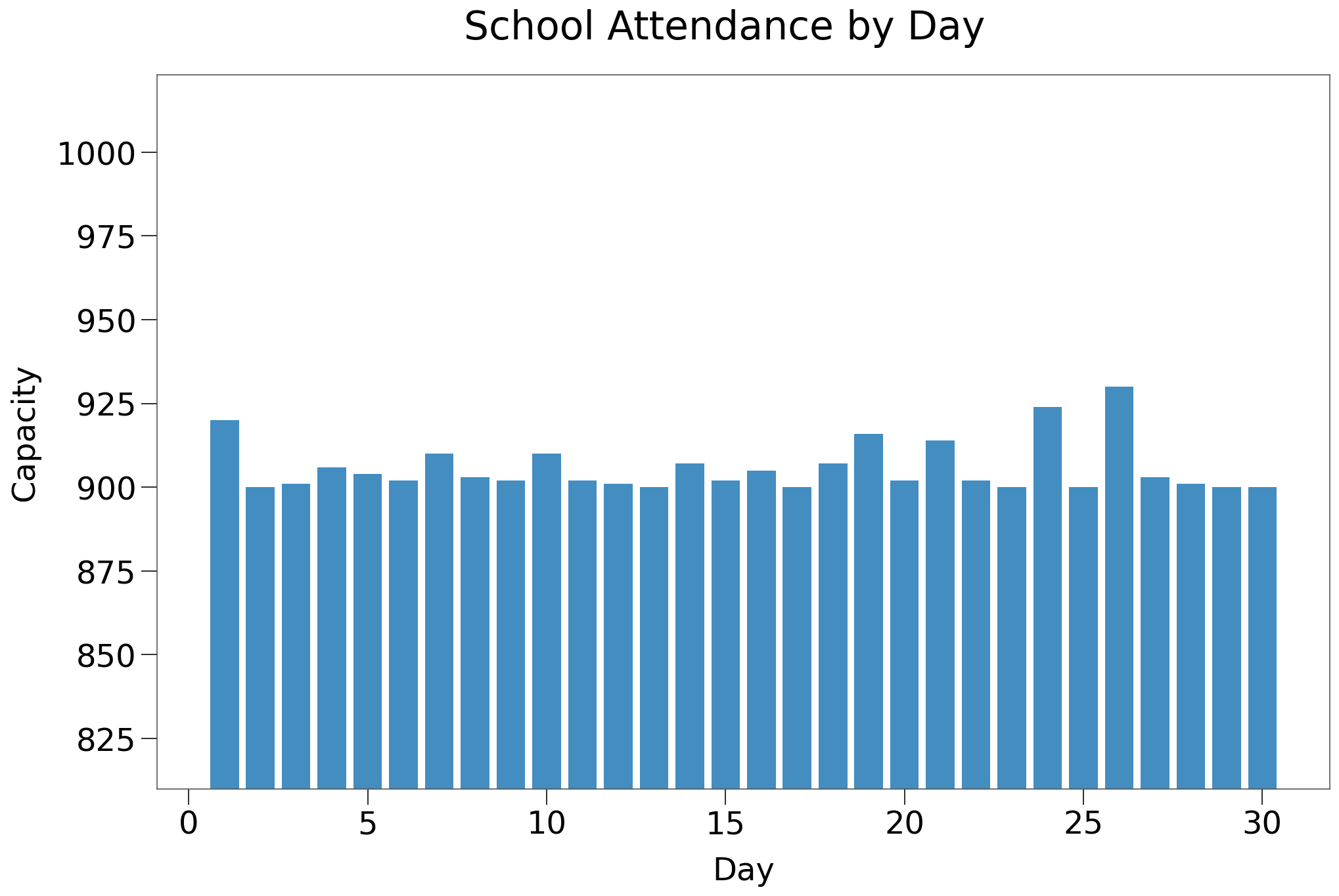
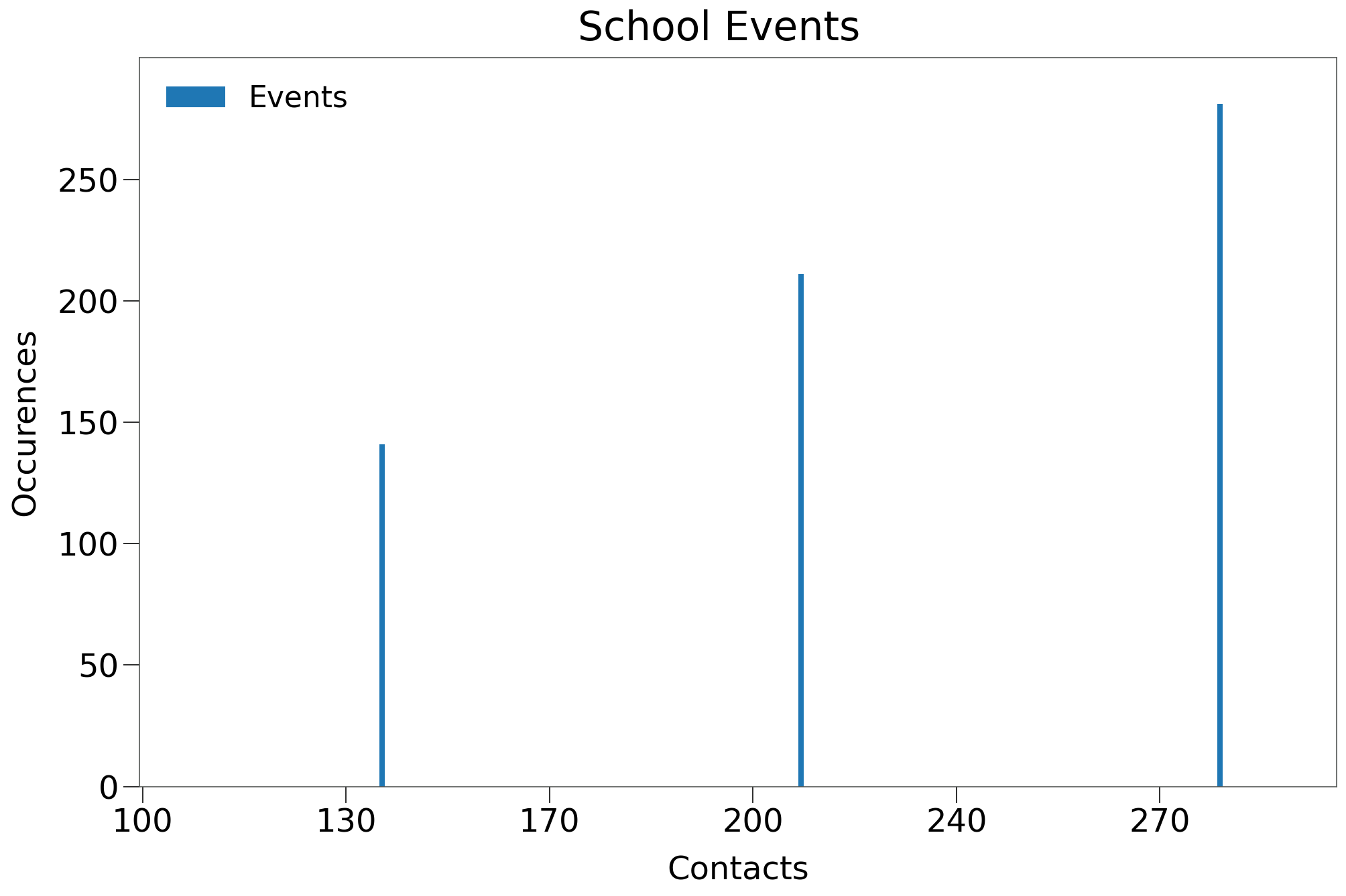
The Schools vbox will maintain ~900 children at each tick, at events of various capacities. Below we confirm the number of 0-19 subjects participating in events in the School box on each tick.
Below we show the contact distribution created by the School box events. These events are randomly reassigned from the existing event structure in the Home Care scenario. This approach should maintain the required contact distribution across the entire environment.
Note the three largest contact events (all 100+ capacity) will occur inside the School box.
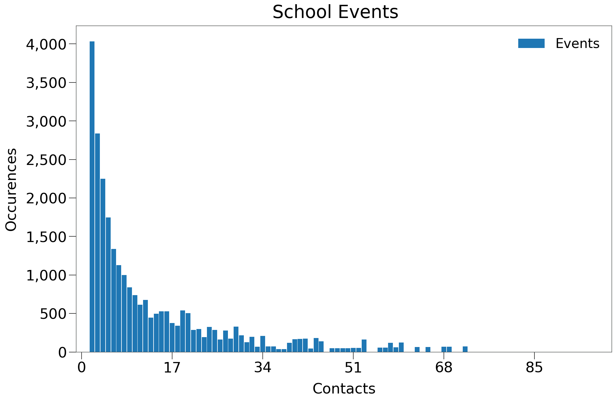
NOTE
The School box events are assigned from the existing event pool in the Home Care scenario. Thus, events remaining in the Event box should help generate contacts that are consistent with the Gamma distribution across the entire sim.
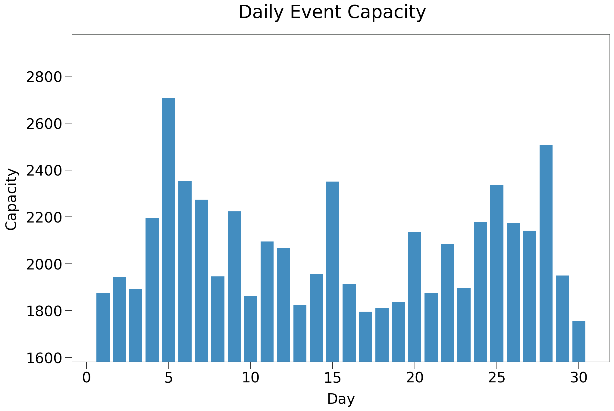
Below, we see the total daily event capacity for the School Box scenario, which is identitcal to the Home Care scenario.
| Schools | Home Care | Schools $R_0$ > 0 | Home Care $R_0$ > 0 | |
|---|---|---|---|---|
| n | 100 | 100 | 19 | 19 |
| Peak | 7.7% | 5.8% | 40.6% | 30.2% |
| HIT | 8.2% | 7.3% | 42.9% | 38.2% |
| Total | 8.9% | 9.2% | 46.8% | 47.9% |
| Fatalities | 0.06% | 0.07% | 0.30% | 0.37% |
| %>70 | 87.3% | 85.2% | 87.3% | 85.2% |
| IFR | 0.22% | 0.14% | 0.63% | 0.73% |
| Days to Peak | 14 | 19 | 58 | 70 |
| $R_0$ = 0 | 70.0% | 51.0% | 0.0% | 0.0% |
We see the curves between the new Schools scenario and the Home Care scenario are very similar, which is the expected result. Note, however, the much narrower spread between Peak/HIT/Total infections. This is indicative of steeper and more abrupt tail to the spread curve.
A sample simulation is shown below:
The results of the simulation are shown below:
Again, the addition of schools results in a similar curve. We can see the steeper curve on both sides of the peak, which in this scenario actually leads to fewer total infections the care home scenario.
The number of fatalities and age distribution are similar as well.
Capacity Restriction w School Exception
We will now incorporate a capacity restriction that does not apply to the newly created School events using the exclude parameter.
from rknot.sims import us_w_load_18
from rknot.events import Restriction

lg = Restriction(name='large', start_tick=30, duration=120, criteria={'capacity': 10}, exclude={'name': 'school'})
params['events'] += [lg]

sim = Sim(**params)
sim.run(dotlog=True)

chart = Chart(sim).to_html5_video()
| 10Max | 10Max ex. Schools | 10Max $R_0$ > 0 | 10Max ex. Schools $R_0$ > 0 | |
|---|---|---|---|---|
| n | 100 | 100 | 31 | 21 |
| Peak | 1.6% | 5.3% | 5.0% | 25.1% |
| HIT | 1.7% | 5.5% | 5.3% | 26.3% |
| Total | 1.8% | 5.8% | 5.5% | 27.6% |
| Fatalities | 0.03% | 0.03% | 0.11% | 0.14% |
| %>70 | 77.5% | 92.8% | 77.5% | 92.8% |
| IFR | 0.52% | 0.18% | 1.55% | 0.68% |
| Days to Peak | 18 | 14 | 41 | 56 |
| $R_0$ = 0 | 51.0% | 72.0% | 0.0% | 0.0% |
From the above, we can see that the approach of leaving schools open leads to a dramatic increase in spread. Below we compare to some other capacity restriction scenarios:
| 10Max ex. Schools $R_0$ > 0 | 10Max 25ADH $R_0$ > 0 | 25Max 50ADH $R_0$ > 0 | 50Max 90ADH $R_0$ > 0 | |
|---|---|---|---|---|
| n | 21 | 29 | 17 | 26 |
| Peak | 25.1% | 15.7% | 11.2% | 13.1% |
| HIT | 26.3% | 19.6% | 17.1% | 19.4% |
| Total | 27.6% | 25.9% | 23.6% | 26.4% |
| Fatalities | 0.14% | 0.25% | 0.23% | 0.27% |
| %>70 | 92.8% | 90.0% | 79.0% | 74.9% |
| IFR | 0.68% | 1.01% | 0.84% | 1.05% |
| Days to Peak | 56 | 67 | 78 | 80 |
| $R_0$ = 0 | 0.0% | 0.0% | 0.0% | 0.0% |
We can see that leaving schools open can result in a spread curve similar to some of the more permissive capacity restrictions that were inspected. Below we show a representative simulation:
The results of the simulation are shown below:
| Schools | 10Max ex. Schools | 10Max | |
|---|---|---|---|
| Peak | 41.9% | 29.4% | 7.4% |
| HIT | 43.8% | 31.3% | 7.8% |
| Total | 49.1% | 33.1% | 8.1% |
| Fatalities | 0.35% | 0.24% | 0.18% |
| %>70 | 85.7% | 95.8% | 100.0% |
| IFR | 0.71% | 0.72% | 2.21% |
| Days to Peak | 79 | 50 | 40 |
We see that providing an exclusion for in-person school attendance makes a 10 max capacity restriction in the broader population much less effective in reducing spread.
Capacity Restriction w School Exception and Non-Compliance
The capacity restriction in the prior sims assumed 100% adherence factor to the 10 max capacity restriction. We will show the results of 75% adherence.
from rknot.sims import us_w_load_18
from rknot.events import Restriction

lg = Restriction(name='large', start_tick=30, duration=120, criteria={'capacity': 10},
     exclude={'name': 'school'}, adherence=.75,
)
params['events'] += [lg]

sim = Sim(**params)
sim.run(dotlog=True)

chart = Chart(sim).to_html5_video()
The results of 100 iterations are shown below for only the outbreak iterations:
| Schools Restricted 75 ADH $R_0$ > 0 | Schools Restricted $R_0$ > 0 | |
|---|---|---|
| n | 22 | 21 |
| Peak | 28.4% | 25.1% |
| HIT | 29.8% | 26.3% |
| Total | 32.0% | 27.6% |
| Fatalities | 0.22% | 0.14% |
| %>70 | 90.7% | 92.8% |
| IFR | 0.67% | 0.68% |
| Days to Peak | 58 | 56 |
| $R_0$ = 0 | 0.0% | 0.0% |
We can see above that additional infringement of the policy amongst the broader population can negatively influence spread, but the impact is muted.
An example simulation is presented below.
[13]:
from IPython.core.display import display, HTML
from rknot.notebook import animHTML
display(HTML(animHTML('us_w_load/' + slug)))
The results are as follows, compared with the 100% adherence sim:
| Schools 10Max 75ADH | Schools 10Max | |
|---|---|---|
| Peak | 32.5% | 29.4% |
| HIT | 33.2% | 31.3% |
| Total | 33.9% | 33.1% |
| Fatalities | 0.22% | 0.24% |
| %>70 | 100.0% | 95.8% |
| IFR | 0.65% | 0.72% |
| Days to Peak | 50 | 50 |
We can see that 75% adherence results in a slightly larger outbreak with a more abrupt tail (evidenced by the narrower spread between Peak/HIT/Total infections). Fatalities were also inline and confined to only the oldest age groups.
Separate Restrictions for Schools
The scenarios up to now have assumed exactly zero policy restrictions on School box interactions. In reality, schools have implemented soccial distancing policies designed to limit spread, which we will attempt to mimic.
In determining the potential restrictions, we have considered some real world examples including the fulsome details provided by the Ontario provincial government (in Canada).
These restrictions include:
- usual social distancing measures of masks, hand sanitizer, separate entrance and exits, etc.
- expected 70% of maximum attendance during the year
- no class size maximums for elementary schools (although students are expected to interact only with student in their class)
- class size restrictions of 15 students for secondary schools
In practice, it is very hard to limit interactions. Videos of schools under these restrictions show long lineups with students in close quarters, using lockers, interacting in hallways etc.
We simulated three different evironments:
- 100Max restriction with 100% adherence
- 50Max restriction with 75% adherence factor
- 25Max restriction with 75% adherence factor
*One possibility we have not considered is that the 0-19 age group is somehow more resilient and incurs fewer infections per contact than the broader population. This simply does not appear to be the case based on the prevailing testing data. In Ontario, for example, not only have children *not* been shown to incur fewer infections, ages 0-24 were all shown to have the highest level of positive tests during the second wave and were still increasing through late Dec 2020 even when all other age groups had flattened out.* See positive results by age group.
Event Specific SocialDistancing
RKnot does not yet have the capability to enact SocialDistancing on specific events, though this feature will be added in the future.
First, we show the implementation of the 100 capacity event restriction in the School box, via the schoolmax restriction. The only difference in the other scenarios include the adherence parameter in the schoolmax object.
from rknot.sims import us_w_load_18
from rknot.events import Restriction

lg = Restriction(
    name='large', start_tick=30, duration=120, criteria={'capacity': 10},
    exclude={'name': 'school'}, adherence=.75,
)
schoolmax = Restriction(
    name='large', start_tick=30, duration=120,
    criteria={'capacity': 100, 'name': 'school'},
)
us_w_load_18.params_schools['events'] += [lg, schoolmax]

sim = Sim(**us_w_load_18.params)
sim.run(dotlog=True)

chart = Chart(sim).to_html5_video()
| Schools No Max $R_0$ > 0 | Schools 100Max $R_0$ > 0 | Schools 50Max 75ADH $R_0$ > 0 | Schools 25Max 75ADH $R_0$ > 0 | |
|---|---|---|---|---|
| n | 22 | 22 | 21 | 10 |
| Peak | 28.4% | 27.9% | 25.1% | 21.0% |
| HIT | 29.8% | 29.4% | 26.2% | 21.6% |
| Total | 32.0% | 31.4% | 28.4% | 24.4% |
| Fatalities | 0.22% | 0.21% | 0.12% | 0.17% |
| %>70 | 90.7% | 86.6% | 88.5% | 80.4% |
| IFR | 0.67% | 0.66% | 0.41% | 0.68% |
| Days to Peak | 58 | 56 | 56 | 51 |
| $R_0$ = 0 | 0.0% | 0.0% | 0.0% | 0.0% |
We can see the progressively suppressed spread curve as we reduce the capacity maximum in the School box. Despite having all 3 of the largest events (all >100 capacity), eliminating those events has any only minor impact on spread. There are simply not enough contacts in generated by those 3 events to spur broader infection.
Spread is only materially impact with a lower maximum that encompasses many more events.
Still, relative to the original 10max 75% adherence restriction, the outbreak in 25max 75% adherence is 4 - 5x larger.
It is difficult to imagine how a school could limit contacts to fewer than 25 per day for students and staff given class sizes and other interactions. And so we see that open schools, even with their own restrictions, can undo much of the work being done by more rigorous restrictions in the broader population.
Below we show a representation simulation:
The results are shown below compared to the original Home Care scenario, which did not have a seperate school vbox or any exceptions for schools.
| Schools 25Max 75ADH | Home Care 10Max | |
|---|---|---|
| Peak | 21.6% | 7.4% |
| HIT | 24.6% | 7.8% |
| Total | 29.0% | 8.1% |
| Fatalities | 0.26% | 0.18% |
| %>70 | 96.2% | 100.0% |
| IFR | 0.90% | 2.21% |
| Days to Peak | 80 | 40 |
We can see from the above that providing exclusions for schools, despite including some restrictions without those schools, significantly impairs the impact of restrictions in the broader economy.
We must consider if an outbreak can ever be prevented if we open schools (and we cannot reduce daily contacts at schools to less than maximum 25 per day).